Emily Naples
Art 430 Senior Project Blog - Spring 2011
Saturday, May 14, 2011
The near end of Senior Project
Sunday, March 13, 2011
Conversations with Mary
 |
| Macquette |
 |
| Working on My Mother |
 |
 |
Monday, February 21, 2011
the first faculty critique results - I'll let you know ALL about it...
The critique; it went --- surprisingly well. I was both worried and terrified, having only "one" piece to show and a fragmented artist statement that got mixed around and added and subtracted to daily due to the nature of my own personal artistic process.
I was incredibly nervous (I usually am confident). I anxiously shuffled through my notes while waiting for my turn to present and looked over at Karen, "Um..." I asked cautiously, "Do we have to have and artist statement?" Karen's response was to the tune of: Its our critique, we can do whatever we want to get our concept across. I was relieved. I had a Hockney quote in my hand that I was going to read, along with some selected sentences from my artist statement that express the intent of my artwork. I have trouble writing a full artist statement right off the bat- or a more precise one so quickly. When I first start a project, I have a very vague concept as to what I want the reader of the statement to know and most of the time what I myself understand about the project I am working on. The statement is very important. It is the words the artist uses to guide the viewer in understanding the artwork. The artist can choose where to guide the viewer, if at all. For me, as the days go by, I confidently narrow in closer and closer to what my statement should be. As of now, the project is midway through, and therefore, my artist statement is as well.
When I hung my project on the wall, it looked lonely. I had envisioned my critique already in my head. I was going to first be scolded on my amount of work, while Karen would then scold me on my printing (which thought was pretty good where conscious contrast decisions were made), Peter would tear me a new hole for some reason (have never really had him a teacher, however, I had seen his reaction (and hopefully it was helpful) to other peoples projects - and I figured I wasn't exempt). I wasn't sure about the other faculty members - but I had a feeling it would not be good.
I sat on a stool next to my print and began to organize thought in my head as to how I would begin. Karen came up for a closer inspection. "Its stunning," she whispered. I smiled. I beamed. It was the confidence boost I needed, at the most appropriate time. My critique; it went --- surprisingly well.
There were many helpful suggestions that stick out in my mind:
1.] It was suggested that I focus more on MY style derived FROM Hockney, not just making something that is "Hockney-Style". It was suggested I vary my vantage points: Zoom out more. Encompass more of the person than just the front of the face. I agree, and will spend more time experimenting with this. This is a major piece of advice.
2.] I was curious about the seemingly necessary introduction of color. The never was really addressed to my liking, until Barb came to me after the critique and suggested that I try printing in a sepia tone. I am willing to try this. [Stay posted for pics.]
3.] It was suggested to me that I show the passage of time in a different way: to have my father dress in different outfits and collage those images. I thought about it for a minute (remembering that had actually thought of doing this myself), but realized that it was a layer of thinking that I did not want to include in my concept. In my case, I feel that the simpler it is, the more it makes you think. I remember telling the faculty member who suggest it that though it was a good suggestion, it was not my intent. I wanted to capture a "single conversation", and how it was my response to the Kodak Image. (See Below) *
4.] I asked about my feelings to include more of an "enviorment" around my subjects; to include a context from which hints of personality to shine through. In this case, I would have liked to show the cluttered yet organized office of my father. I don't think that idea was received as well, so I think that I am going to stick with the traditional shoulders and head shots.
3.] Many people seemed to respond really well to the black and white version. The more time I spend with it, the more I like it. Surprisingly, I cant remember anyone getting a feeling of macabre. Instead, many students thought it was elegant. (Correct me if I'm wrong....I want to know ALL the feelings it evoked).
4.] A classmate piped up "Thats going to be a great memory of your parents". Eek. I guess.
*I had brought up a point in speaking about my work, that I had considered but never really fully elaborated on until then; it was that this type of art is IN REACTION to Cartier Bresson's "Decisive Moment". I expressed that there will never be a Kodak image of my father. There will never be one image, one view of my father. Different people have different memories of my father, and each one paints the picture of my father in many different contexts. There is not one story that could define the complexities of my father. He is held together by many stories, that make up his IDENTITY, and that build his personality.
Wednesday, February 16, 2011
Tuesday, February 15, 2011
conversations with Eddy
 |
| Conversation(s) with Eddy/Dad |
 |
| (The lucky gal who I spent Valentine's Day with!) - Paugburn in Process |
MY RESPONSES and QUESTIONS and THOUGHTS...so far...some minor tweaks in concept:
 -I'm not sure black and white is working for me. I am hesitant to print entire plates in color (they are about 5x7 each), its not the look I was going for. I wanted the work to be in black with color accents. The color macquettes work really well for me, I enjoy seeing the colors of his flannel and skin, and I don't get that same amount of "color" in the conversation when its in black and white. In fact, for me, I can imagine these assembled in my head, and it is more macabre than enlightening. I want the images to speak lively of the conversation - of the personality. I feel like these black and whites are more...well....I think they will evoke a negative response as opposed to a positive one. Though the feel from the macquette is not "negative"...I am pushing the viewer to this by printing dark and mysteriously.
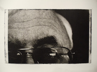
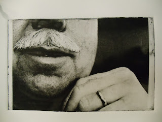
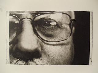
-There is a good level of contrast in some of the prints (which is ok...I had intended on printing with multiple levels of contrast to add a visual narrative to a "variation" the the variety of emotions he showed during our conversation. I really wish his EYES had more detail. I feel like that is something that should be very closely paid attention to. I like that his salt and pepper hair is a focal point, his glasses (old looking), his wedding ring, his flannel and his teeth are all personality traits of his that are emphasized. I did not ask him to prepare for this. I wanted my father as is - as I had popped in for a conversation. We shot the images in his work office - his space - natural light with a 50mm Sigma macro.
 -I like that I was able to maintain a rich black in my blackest blacks. It took a but of spot inking and a tender touch, but it seemed to work well. I wish though, that there was a greater level of detail in his shirt. I do like that the focus points I chose in many of the individual images retained their crisp DOFs, like in his moustache and glasses, my fathers signature look.
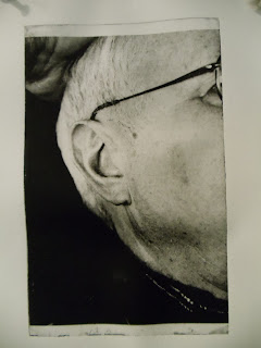
- I noticed that, due to the very nature of the method by which I am moving around and clicking the camera, I am playfully invasive. Does this ruin for the viewer the authenticity of the intent? My intent is to record a conversation on film- the position changes, the varied facial expressions and the texture of the person being photographed. Whether it be light hearted or serious, I am trying to show the varied complexities in personality and presence through conversation (and mannerisms). SIMULTANEOUSLY I aim to challenge the viewer to re-assess the reverse effect of photography of this type of image assembling and collaging. The act of taking a photo causes a 3D world to be translated to 2D image. This type of arrangement is in a sense, re-assembling that 3D world into a 2Dwith a varied multiplicity of views. (the side of the face AND the front of the face). [In this case, my father shifted positions many times, and appeared serious in from of the camera. At another point he relaxed, and rested back in his chair. At another point he felt he wanted to pose. My father and I had light hearted conversation; school, weather, work. Sometimes he looked at the camera, sometimes not. However the big factor in presentation of my father is ME, and when I chose to click.]
- QUESTION: I am using mainly people I am familiar with (family and friends) to do the collages. How would the content change if I did this with a complete stranger? How would the "unknown" benefit me and/or add to my concept? What type of conversation could we have and how would it reflect on what I as the photographer AND the converser view the personality and mannerisms of someone with whom I am unfamiliar?
-I like that this concept is loose, it allows for interpretation of a variety of different emotions and conversational interactions - for series work.
-I like that this concept is loose, it allows for interpretation of a variety of different emotions and conversational interactions - for series work.
 -I would like some feedback on what I discussed above, and the introduction of color. Is this new concept interesting? (Personality in Images and new views through conversation?).
-I understand these are not assembled in the blog, but what do YOU as the viewer SEE in the images? What was your reaction to the translation of the color macquette to the black and white print? Where would you like to see color?
Friday, February 11, 2011
Thursday, February 10, 2011
Heavy Reading
I ordered and read a book from the artist who is inspiring my work this semester. The book is called "Thats The Way I See It" by David Hockney. The information in this book is sinking in nicely for me. He explains things I see and have trouble explaining myself:
Some informative/selected quotes:
"...I realized I was opening up something else, that here was a marvelous narrative; what I was doing became clearer: I was using a narrative for the first time, using a new dimension of time." (p.97)
"...dissatisfaction of [and in sometimes in opposition] to naturalist fixed-point perspective space..." (p. 101)
"The moment when you realize what Picasso's doing...It becomes a very profound experience, because you can see that what he is doing is not distortion, and it slowly begins to look more real and real. In fact it is naturalism that begins to look less and less real. And that, of course, leads you into thinking about he nature of realism and what is is and what it isn't. You become aware, perhaps more than ever before, that there are different forms of realism and that some are more real than others." (p. 102)
"...so what I'm talking about is the world, and pointing out that there are different ways of depicting space; one way is the keyhole way, essentially the window idea with a one point perspective. The window is just a big keyhole with edges around it. You are deeply conscious of these edges. I began to be obsessed with them and also by the realization tat you might be able to break them...the edge has to do with movement and time and most essentially with the representation of space...the moment you acknowledge the surface, you acknowledge the edge...You realize that they relate to where you think you are and therefore who you are. Then you begin to link spacial ideas with identity. " (p. 102)
"...cubism seemed to many people to be about one persons subjective perception of reality. And that was what Einsteins theories also seemed to be about. Before Einstein, time and space were considered separate and absolutes -- they always existed. Einstein said, This is not the case. They are not absolutes and they depend a great deal upon the observer; different observers see different events at different times. Such a view also seemed to break up the notion of a shared reality-it [aided in] establishing [the notion] that we all see a little bit different." (p. 125-126)
Any one have anything to add?
Subscribe to:
Comments (Atom)


